botw-logo-small-2.png

Blood of the Werewolf is a hardcore action/platformer video game from Scientifically Proven. I served as the Lead Artist on the project, and was tasked with defining the game's entire visual brand, from the text and logo right down to designing each character and painting every drop of water.

Having designed/created every individual art asset for this game, it's been pretty tough to decide what to feature here. It's been quite the process, so I'm still adding to this as I go, and what's here is more of an overall sampling of all the roles I played in the creation process. Please feel free to contact me to see more or with any questions.

_0003_character-design.png

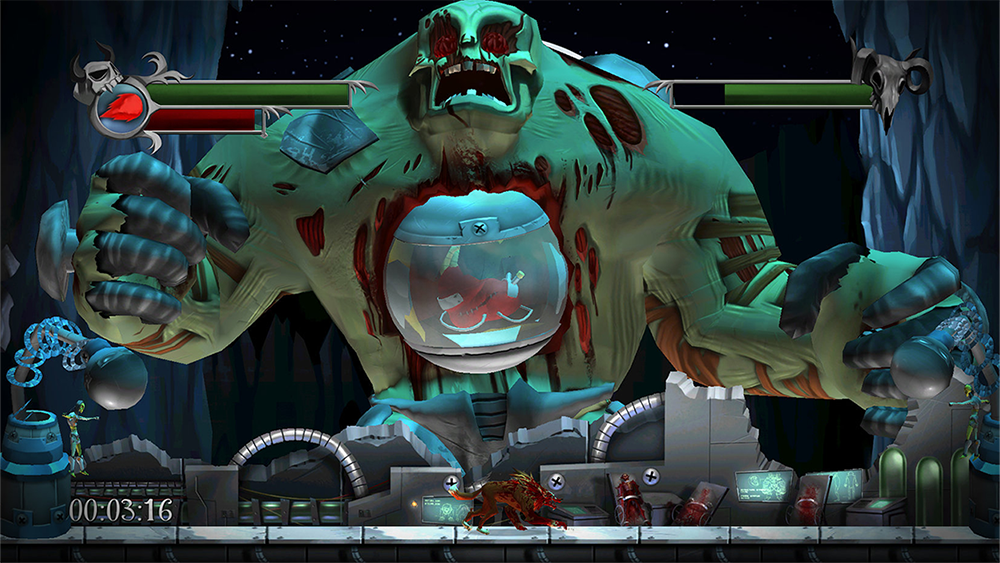
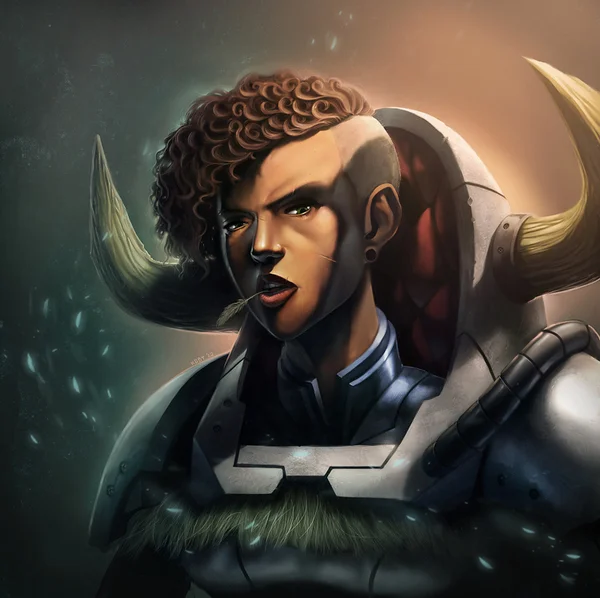
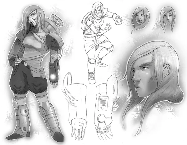
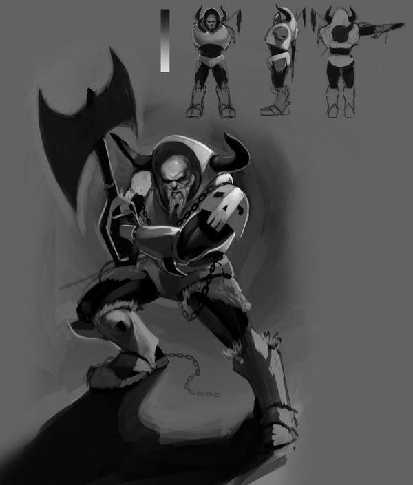
I love designing just about everything, but I'd have to say that my favorite thing to work on is characters. There is just something so incredibly rewarding about coming up with a look and feel to fit a personality and storyline.

I designed all 40+ characters, monsters and bosses for Blood of the Werewolf. It was a great labor of love, and I'm more than happy to share with you a couple of my favorites below.

I did all concept work, portraiture, design, model sheets and model texturing. I did not create the 3D models.

selena.png
dracula.png
bride.png
creature.png
hyde.png
_0002_environment-art.png

From the very beginning, one of my goals with the environments of Blood of the Werewolf was to make each of them unique and interesting. To do that, each of the levels was hand painted and wasn't made up of tiling pieces. Essentially, each of the levels was it's own giant painting.

This is a zoomed out view of a complete level layout.

This is a zoomed out view of a complete level layout.

This is a view of that same level open in the editor while I worked on it.

This is a view of that same level open in the editor while I worked on it.

Here is an isolated segment of that same level, showing more of the detail. This is what I would paint in Photoshop before placing it into the game world.

I wanted the backgrounds to really convey a unique sense of the world that the game takes place in. Throughout the story of the game, the player learns of a nation torn apart by a great war between monsters and demons of every variety. I wanted each of the areas to give off the impression that they had been pillaged and decimated by years of fighting. Along with the voice-acting and onscreen action of the game, I wanted the world itself to play a part in the narrative. I wanted the levels to work together to help tell the story.

In addition to the solid painting that served as the main backdrop, the game world was comprised of a great deal of moving parallax pieces and animations. 2D animated assets like burning torches and falling leaves littered the landscape, while other large assets would be scrolling by in the distance, such as forests full of trees, forgotten underground caverns, and eerie graveyard hills.

To create the art for the level, I would work heavily in the game engine, moving back and forth constantly between using the editor and creating content in Photoshop.

This screenshot marks the beginning of the process for me. I would be given a grey box level design and work with the designers to decide the theme and mood of each level. From there I would set up the initial files and bring them into Photoshop to …

This screenshot marks the beginning of the process for me. I would be given a grey box level design and work with the designers to decide the theme and mood of each level. From there I would set up the initial files and bring them into Photoshop to work some magic on them.

This is an a shot of that same layout above with a fresh coat of that Photoshop magic I was talking about earlier. The black shapes throughout the image denote where the 3D geometry would be laid.

A newer edition to the game was an endless mode, where players will go through an infinite number of randomly generated rooms until they run out of health. For this mode, I created a modular set of "room" pieces that were set up in a way so that they were able to tile with one another seamlessly. This would keep locations feeling fresh and interesting, while still allowing for the game to dynamically evolve as the player continued forward.

_0001_user-interface.png

I wanted the interface for the game to maintain the worn, classic feel that the in-game world had. Taking cues from the worn and weathered world, I added skeuomorphic elements to the design so that the interface would convey the feeling that it really belonged in this world.  Menus, frames and buttons all had a heavily-used feeling to them, featuring all sorts of wear and tear like scratches and dents and looking like they had been forged of soft metals like pewter.

A shot showing the options being tweaked in the main menu. The background features animated grass, cattails and stars, while silhouetted bats will periodically take flight past the moon.

A shot showing the options being tweaked in the main menu. The background features animated grass, cattails and stars, while silhouetted bats will periodically take flight past the moon.

An important aspect of the game is collection and speedrunning. With this in mind, I designed the level select screen to show all of the information that the player might be looking to improve on in an organized fashion. All collectibles are represe…

An important aspect of the game is collection and speedrunning. With this in mind, I designed the level select screen to show all of the information that the player might be looking to improve on in an organized fashion. All collectibles are represented as well as character deaths and level completion time, coaxing the player to try again to get even better results and rank higher on the leaderboards.

Another menu frame showing some of the Achievement icons that I got to design for the Xbox versions of the game.

Another menu frame showing some of the Achievement icons that I got to design for the Xbox versions of the game.

The inventory screen shows the player what has been collected and unlocked so far. Within the pewter frame, the menu exists atop a pool of blood. As the cursor is moved around, the blood will ripple, adding a nice subtle animated effect to the menu …

The inventory screen shows the player what has been collected and unlocked so far. Within the pewter frame, the menu exists atop a pool of blood. As the cursor is moved around, the blood will ripple, adding a nice subtle animated effect to the menu to keep it visually interesting without being distracting.

_0004_cutscene-art.png

Starting with sketches and color roughs, I storyboarded each cutscene to detail how each shot would play out in a scene. In order for them to be animated, each of the scenes below were fully rendered illustrations that contained each individual piece on a separate layer.

Curse-Storyboards-3.png
alternate-ending-storyboard.png
marco.png
castle.png
hallway.png
fireplace.png

Here is a sneak peak at the opening cutscene during the intro for the game!

_0000_promo-art.png

These are a few examples of some of the promotional art I worked on for the game. These have been used as the cover for the game and for advertising, press releases, assets for websites such as Gamestop and GOG.com, and console-specific stores.

This was actually the first cover that I created for the game. Intended to be an homage to both classic horror movies and classic Nintendo box art, this was a more action-packed cover variation.

This is the painting I did for the main cover/promo art for Blood of the Werewolf.

For their digital game distribution site, GameStop had me create a few various site background layouts for them. As part of a promotion, they cycled through various backgrounds, so I worked alongside their web team to create specialized assets that they could use for ads on the site.

1864x1272.png
BOTW_GSPC-Takeover-v2.png

Along with website assets, I also created individualized assets for various retailers and console spaces. Below are a few examples of banners that were created to be used in stores for Xbox, Playstation and various other digital retailers.

BOTWerewolf_PS3Game_Featured2_English.jpg
BOTWerewolf_PS3Game_IABSky_English.jpg

For more information, screenshots, trailers and purchases click below

eyes.png
botw-thumbnail.jpg

I moved these animations over to their own page to cut down on some load times. Please click on the button above to return to the main Blood of the Werewolf page.

2D-animation.png

I wanted all of the particles and effects to really stand out from the backgrounds in each level. To do so, I designed each one to have a very bright and simplified feel. All of these were animated frame-by-frame so that they would have a very traditional, hand-drawn feel to them.

bat-v2-copy.gif
Blood-Splash-3.gif
multiplayer-powerup-copy.gif
lava-wave-3-copy.gif
Lava Wave Outro Example.gif
wolf-charge.gif
shockwave-2.gif
bat-hadoken.gif
paper-4.gif
dirt-burst.gif
lab-screen.gif
Fishman-Fireball-v2-copy.gif
mummy-skull-anim.gif
Rock Wall Dust Example.gif
electric-mutant-attack-example.gif
time-pickup-copy.gif

Operation Dead Hand

5bd41c184bc937e10fff30f95cf815a3.jpg

The Cliff's Notes version of Operation Dead Hand is that after a nuclear fallout nearly worldwide, a regime has taken over what's left. The story follows a rag-tag guerrilla militia as it struggles to deal with the looming regime as well as other private military groups.

It is a project I began while I was still a student and something that I've been working on ever since in a when-I-get-time capacity.

Early character design sketches for Nina

Early character design sketches for Nina

Additional character designs for Nina, featuring some armor and prop concepts

Additional character designs for Nina, featuring some armor and prop concepts

Refined character portrait of Nina

Refined character portrait of Nina

Battle Suit armor design and turnaround

Battle Suit armor design and turnaround

Character design sketches of Boris

Character design sketches of Boris

Boris character portrait

Boris character portrait

5bd41c184bc937e10fff30f95cf815a3.jpg
splash-screen-v2.png

Elements on the Loose is an educational game that I worked on for LeapFrog. The goal of the game was to teach kids about chemistry, focusing on a handful of important elements on the periodic table. I was the Lead Artist on the project, developing the look and feel of the game and creating all art assets.

The target audience for the game was children ages 6 to 9. Because the users would be early readers, the challenge of designing for this game was creating a user interface that would be easy to navigate with minimal text. I also wanted to focus on making the game bright and full of colors and motion to make sure we could hold the user's attention.


User Interface

A shot of the main menu. All of the interactive images were labeled and outlined in white to make them stand out. They also had a bit of movement to them during gameplay, hopping up and down slightly.

A shot of the main menu. All of the interactive images were labeled and outlined in white to make them stand out. They also had a bit of movement to them during gameplay, hopping up and down slightly.

A screenshot of a menu screen showing the elements the user has collected. Tapping on an element would bring you to the screen to the right.

A screenshot of a menu screen showing the elements the user has collected. Tapping on an element would bring you to the screen to the right.

After selecting an element, the user would be able to learn more about it through images and voice over narration.

After selecting an element, the user would be able to learn more about it through images and voice over narration.

To display information about the elements, we decided to use a chalkboard motif. As the user progressed through the options on each screen, the game would use an animation I created of the chalkboard flipping around to reveal the next menu items on the other side. Ideas like the chalkboard were chosen because we wanted to keep as many "real-world" metaphors in the game as possible to keep things familiar for the children.


Character Design and Customization

A few examples of user-customized Professors

A few examples of user-customized Professors

Since much of the game had to be narrated, I was asked to create a character that would guide users through the interface and gameplay. Professor Atoms was created to be a cheery instructor that would pop up throughout the game to assist users. I designed the professor to have a gender-neutral look so that we wouldn't be excluding any demographic. Additionally, I created a whole smattering of clothing items that kids could use to dress up the professor to their liking, lending a personal touch to the character.

A shot of the customization interface

A shot of the customization interface

Some of the assets I created that users could use to dress Professor Atoms

Some of the assets I created that users could use to dress Professor Atoms


2D Assets

quiz.png

One of the most important aspects of the gameplay involves users answering questions about the elements used in the mazes. To use another real world metaphor in the design, the quizzes all take place on the Professor's clipboard. As the user navigates through different screens in the quiz, the clip at the top will open up and the paper will slide offscreen, revealing the next set of options.

The quizzes themselves are all multiple choice questions, with the answers all consisting of images. Below are some examples of the graphics I created for each answer.

quiz-answers-1.png
quiz-answers-2.png

For more information, screenshots, trailers and purchases click below

splash-screen-v2.png
Dino-Gliders-Logo.png
This is an illustration I created featuring the two main characters of the game.

This is an illustration I created featuring the two main characters of the game.

I served as the lead artist on T-Rex Rush: Dinogliders, which is an education children's game for Leapfrog. The game teaches kids about both spelling and dinosaurs. Leapfrog wanted us to create a lush world with all sorts of plant and animal life existing within it. Taking into account the small screens of the devices it would be played on, I focused on adding detail, but keeping things still very bright and stylized so they would read even at a small scale.


Characters and Animations

The player character was rendered in 3D and then converted into sprite sheets that would be used in the game. I worked on the model texture and created all the sprite sheets for the in-game animations.

ty-runniing.gif
ty-backflip.gif
ty-copter.gif

Some sections of the game featured flying eggs that the player would tap on to answer questions. I created a 2D animation and a variety of different looks for these eggs depending on which level they appeared in.

t-rex-rush-2-game-app_59318-96914_3_SC.jpg
egg-animation-v3.gif

3D Environment Textures

The world that is used during gameplay was also rendered in 3D. For these sections I created long tiling textures so that I'd be able to cram in a bunch of details that would keep things looking fresh and unique without the player constantly seeing the same exact piece over and over again.

t-rex-rush-2-game-app_59318-96914_4_SC.jpg
t-rex-rush-2-game-app_59318-96914_5_SC.jpg
texturess.png

Cutscene Illustrations

In order to tell the story of the game we created illustrations that would be accompanied by narration and voice acting. Below are just a few of the scenes that I painted.

NIS4_2 copy.PNG
NIS3_1 copy.PNG
NIS5_2 copy.PNG

For more information, screenshots, trailers and purchases click below

NIS5_1 copy.PNG