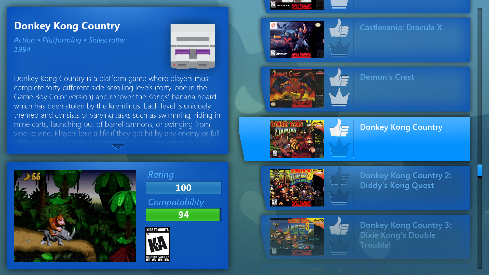
Emulator Interface

This is a shot of the interface in action with the user selecting a Super Nintendo game.

This is a shot of the interface in action with the user selecting a Super Nintendo game.

This was a project I worked on with a programmer colleague of mine on and off for a few months. For years, emulators have given gamers a way to play backups of older video games on their computers. The easy access to enormous libraries of games has been great, but we noticed that every system required a new emulator and a new interface. Our goal was to create a system that would compile emulators for all of our favorite systems and house them all within a singular, streamlined user interface so that users could hop between different games and systems seamlessly. 

Wanting to create a console-like experience, the interface was designed to work with the standard keyboard and mouse, but it was also designed to be simple to use with any sort of gamepad. This was something I had to keep in mind when creating the menu flow and the overall look and feel of the interface, since some gamepads could have less buttons than others. Ease of use was a huge priority, along with creating a clean, modern look for the menus.

Along with creating and designing all of the graphical assets and layouts for the interface, I also created custom icons to represent the systems that were being emulated, which turned out to be a fun project on its own!

Here are a few of the icons I created to represent the different systems present in the interface.

Here are a few of the icons I created to represent the different systems present in the interface.

Nunya copy.PNG

User Interface Website

site-home-1.jpg

Designing a website for a company that specializes in user interfaces was a tricky endeavour. The site had to show off the abilities of the company, but I wanted to make sure that it wasn't too distracting or flashy so as to take away impact from the portfolio of work that it was displaying. The website had to be simple to navigate and really show off the body of work that the company wanted to showcase, but there are some serious expectations set when the website is representing a company that specializes in design. Meta!

This is a shot of the home page. Using either the mouse cursor or the arrow keys, the user can select between various options around the gear. As different options are highlighted, the gear itself would turn and lock itself in place.

This is a shot of the home page. Using either the mouse cursor or the arrow keys, the user can select between various options around the gear. As different options are highlighted, the gear itself would turn and lock itself in place.

The aesthetic of the website was built around the idea of virtual space and the concept of a digital factory. I wanted to take iconic objects such as bolts and gears and repurpose them as tools the users could manipulate to navigate the site. I wanted to focus on bold text and a simple white-line blueprint look to the objects.

This was the initial look of a client dossier. More of a flat layout that would focus on the information it was presenting. The gear on the righthand side would move up and down as the user scrolled through text.

This was the initial look of a client dossier. More of a flat layout that would focus on the information it was presenting. The gear on the righthand side would move up and down as the user scrolled through text.

The design evolved to take more advantage of the idea of virtual space, with certain aspects being on different axes. A slideshow of images would crawl across the top.

The design evolved to take more advantage of the idea of virtual space, with certain aspects being on different axes. A slideshow of images would crawl across the top.

Clicking on an image in the slideshow would cause the camera to zoom in on it, revealing more information about the image.

Clicking on an image in the slideshow would cause the camera to zoom in on it, revealing more information about the image.

site-home-1.jpg

Race Care Interface

A shot showing all of the tabs visible.

A shot showing all of the tabs visible.

The challenge with designing an interface for a race car came down to displaying the information in a quick manor that would be simple for the user to read. Since the operator would be travelling at great speeds, it was important to make sure everything was legible and user friendly so as not to distract the driver from the race.

I wanted to keep things bright and colorful to help the information stand out. I used different colors to represent different information with the intent of grouping certain stats together for the driver. That way he or she could easily look over and see what was necessary by looking for a certain color, such as orange for the temperature. At the same time, I added some chrome elements to the display to emulate the feel of looking at a traditional dashboard cluster.

A shot demonstrating the interface when none of the tabs are visible.

A shot demonstrating the interface when none of the tabs are visible.

Along with the usage of color to denote specific information, I also wanted to give the driver more control over what numbers would be displayed. I started working with the idea of tabs to give the driver options as to whether or not certain statistics would be necessary for a given race. This would help eliminate screen clutter and avoid feeding the driver too much extraneous information. The tab system was designed so that as needed, the driver could easily pull them out to make more information available, or quickly tap for a quick peek at the it before it hid itself again.

Venturi-Display-open.png

Trade Show Interface

For the Consumer Electronics Show (CES), I created an interface to represent a touchscreen design company. We wanted attendees to be able to experience some of the capabilities of a touch interface, while also giving them content to explore that would relate to the company and what it does. The end result was a dashboard that would encourage user interaction instead of just being the typical passive display.

A view of what the icons looked like for each section.

A view of what the icons looked like for each section.

Since everybody's first instinct on the show floor was to touch a screen with their finger, I based the design around that action. There would be information displayed on the top of the screen along with a text crawl at the bottom. A frosted glass-looking frame around the edges would demonstrate to the user where he or she would be able to touch. Once the user pressed down, four options would appear around the spot that was touched, allowing the user to select from viewing staff bios, a demo reel, an interactive timeline, or an image portfolio of the company's past work.

A shot of the Bio screen using a placeholder portrait graphic.

A shot of the Bio screen using a placeholder portrait graphic.

Selecting the Bio screen would bring the user to a screen that would present each of the staff members one by one. Near the top of the screen is a white bar that the user could tap or slide a finger on to switch between each of the members of the team. The frosted glass frame would remain in place throughout each screen.

A shot of the Timeline featuring information about the first computer mouse.

A shot of the Timeline featuring information about the first computer mouse.

Another feature that I put a lot of work into was creating an interactive timeline. We wanted to feature some of the big inventions and breakthroughs in technology that have really helped mold the tech landscape and bring us to where we are today. The timeline was laid out along a large, circular path, represented in the image above by the large red curve. Users could either tap and drag along that line or tap other images along the timeline to advance through the entries.

3d-timeline-v3-copy.png

Car Touch Screen Interface

The goal of this project was to prototype a system of touch screens throughout a vehicle and communicate with one another, linking the driver to all of the passengers in the car. 

A shot of the interface on the driver's screen with the navigation app running.

A shot of the interface on the driver's screen with the navigation app running.

The challenge with this project was that the different screens required different interfaces. The driver would use buttons on the steering wheel to navigate through the system on a landscape-oriented screen, while the passenger would navigate through touch controls on a portrait-oriented screen.

One situation that was prototyped was directions being pushed from the passenger screen to the driver. The idea was that the screens would share information so the driver wouldn't have to take hands off of the wheel to look up an address. The screens would also share warning notifications, such as the seat belt message in this animation.

thumb.png

Radial Menu

radial-screens.jpg

This was a prototype I designed and developed for a vehicle interface. I wanted to create something that was elegant and beautiful, with a sleek modern feel. Clean lines and bold, contrasting colors were the defining visual features I designed around.

A shot of the contact list open during a call, showing the sidebar functionality with multitasking.

A shot of the contact list open during a call, showing the sidebar functionality with multitasking.

A shot of the home screen with menu open.

A shot of the home screen with menu open.

During my research and concept phase, I realized that one of the biggest problems with any interface in a vehicle is that it requires the user to look down, especially if it doesn't use any physical buttons. Working to solve this problem, I developed the Radial Menu. The home screen is designed so that the user is able to press anywhere on the screen, causing navigation circles to appear in a radial fashion around the users finger. Without removing the finger from the screen, the user is able to swipe in the direction of one of the navigation circles, causing that app to open. The benefit to this is that once a user knows the direction of any certain app, it can be opened with a quick press and swipe motion, without requiring the eyes of the user - just good ol' muscle memory.

The user is presented with a clear home screen which displays information in the corners such as weather, radio station and devices connected. This would keep things uncluttered and organized, while also being visually appealing.

Radial-Radio.jpg
Radial-iPod.jpg
Radial-iPod-Library.jpg
Radial-Welcome.jpg